
Why This Isn't On Substack

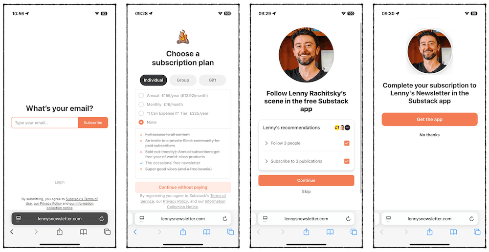
As someone who makes a living building websites for businesses, Substack’s subscribe flow has always ticked me off. You're subjected to a half-dozen pushy upsell screens straight out of the gate.
I kvetched about it to Peter Ramsay, and he responded in true form by creating a first-class UX case study, complete with memes involving Shane Gillis and Renaissance sculpture.
So when you subscribe to my newsletter, all you have to do is enter your email addy and hit the confirmation link in your inbox. That's it. Behold:
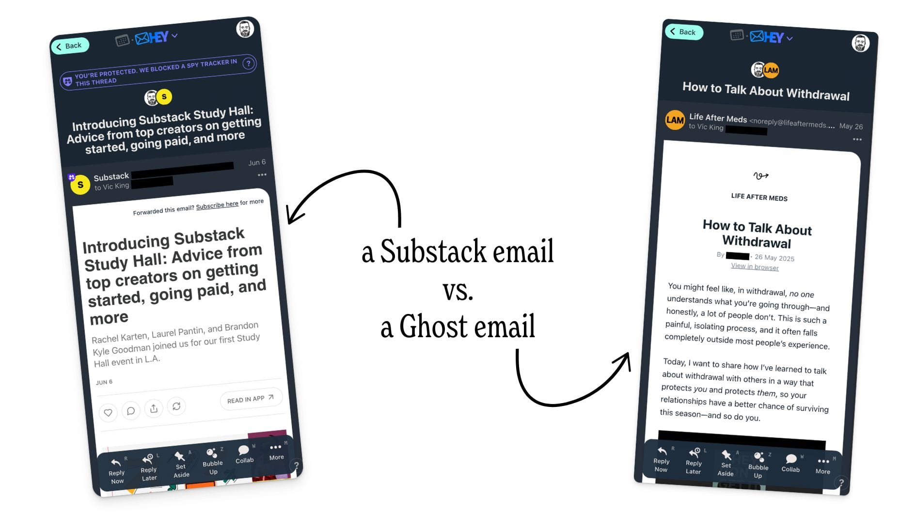
A top-heavy email design
This is a lesser quibble, but Substack includes so much extra info and buttons in their emails that, on mobile, the entire first load often includes none of the body of the email:
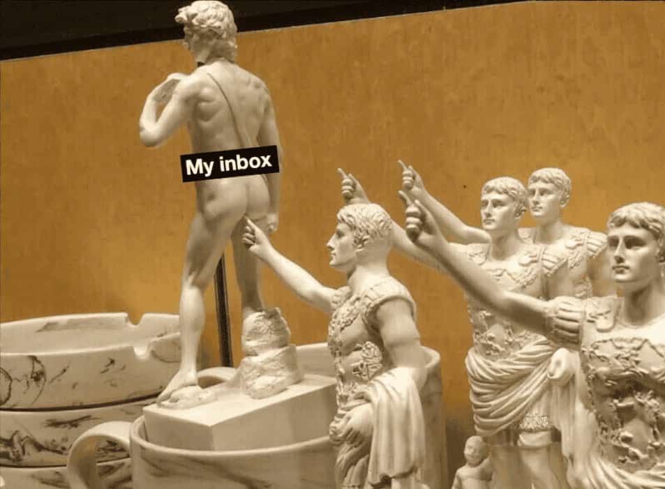
I want better for you
I’m willing to pay for Ghost so that you, dear reader, can have a better experience. My promise to you is that subscribing to my newsletter will never feel like this:
Don’t believe me? Try it for yourself.
Go write something down on paper.
No spam, no sharing to third party. Only you and me.
Member discussion